Featured Resource
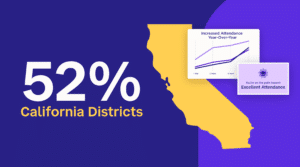
Why Over Half of California School Districts Trust SchoolStatus
Read More >Join Mission: Attendance to reduce chronic absenteeism in 2025-26! >> Learn How <<


It’s December and you’re chugging along with observations, walkthroughs, goal-setting, coaching cycles, and other instructional leadership activities. If you’re a TeachBoost user, questions like “how do I log in?” have subsided as your colleagues settled into the new school year (and for first-year Boosters, a new platform).
You or your team now have the bandwidth to your think about the semester ahead. This is perfect timing: the data you’ve collected these past few months is ready to be analyzed and acted on!
One of the easiest ways to spot trends and plan more personalized PD is to leverage our Teacher Competency Matrix. Here’s how to access the report, understand and filter the information presented, and take action on the insights you glean.
(Psst: TeachBoost users, check out an in-depth exploration of the Matrix in the Support Center.)
Every TeachBoost administrator has access to the Teacher Competency Matrix. Head to your “group” tab (usually labeled as school, district, group, or caseload) and click the green Insights button.

Select the Teacher Competency Matrix and voila: you’ve arrived.
This report displays a tremendous amount of information on educator performance. Below is annotated copy of the report: do you know what each color highlights?

This report is essentially a heat map built around your observation framework. To start, click on the little water droplet—this will remind you of your rating scale.
Next, click the “More Options” button, which allows you to control the information being aggregated and displayed.

Looking at this pop-up, I understand that the number in each colored cell represents the average rating for any given teacher. I also can see the framework that’s being used, and if I’m managing multiple frameworks, I can select the “Change Framework” button to toggle between instructional rubrics.
To discern which data is the most reliable, select the option “Show count of ratings in each cell.” That will tell you how many times you’ve delivered feedback and ratings to each teacher on every indicator. The higher the number the in the box, the more reliable the average rating (which will still be displayed by the cell’s color).
With that information in mind, it’s now easy to understand what my matrix is telling me:

How did I know that we as a school are stronger in Domain 2 rather than Domain 1? The colors of the boxes and the “Averages” row are my keys.
Do you want to see every piece of data collected in one spot, or would you prefer to exclude the coaching or formative ratings? Head to “More Options” and select “Change Form Type.”
If you’re a district or an organization that monitors a number of schools or groups, each group or school that you oversee will present itself on your Matrix so that you can compare groups and spot district-wide trends.
Thanks to KIPP San Antonio for all of their feedback and guidance on the current Teacher Competency Matrix. Also, shout-out to IDEA Public Schools, whose vision and partnership has us excited about the Teacher Competency Matrix, Version 2.
 SchoolStatusSchoolStatus gives educators the clarity and tools they need to get students to class and keep them moving ahead. Through our integrated suite of data-driven products, we help districts spot attendance patterns early, reach families in ways that work for them, and support teacher growth with meaningful feedback. Our solutions include automated attendance interventions, multi-channel family communications in 130+ languages, educator development and coaching, streamlined digital workflows, and engaging school websites. Serving over 22 million students across thousands of districts in all 50 states, SchoolStatus helps teachers and staff see what matters, act with speed, and stay focused on students.
News, articles, and tips for meeting your district’s goals—delivered to your inbox.


